A Responsive design means that your design looks good on various screen sizes and devices - from wide screens found on desktops and laptops to small screens found on tablets and phones.
Responsive design is achieved by setting different styles for elements depending on the width of the browser viewport - e.g., stacking columns vertically, using relative units like REM instead of PX, and using smaller unit sizes below a certain width.
Viewport Preview Toolbar
To preview your design at various screen widths, click on the desired viewport size on the Top toolbar.

By default, Oxygen displays your responsive preview at one pixel wider than the next smallest width from your chosen width.
To adjust the preview width, click the responsive ruler at the bottom of the screen, then drag it left or right.

Creating Responsive Styles
In Oxygen, most properties can have different values for each browser viewport width.
To customize the value of a property for a particular screen size, select the viewport you wish to create styles for from the Viewport Preview Toolbar.
All edits made to the property at this width will only take effect at this width and below.
Hiding Or Showing Elements Based On Screen Width
To hide an element below a certain screen width, choose the viewport you wish to hide the element below. Then, from Advanced > Layout, set the display property to none.
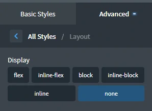
To show an element below a certain screen width, choose the All devices viewport and set the display property to none. Then choose the screen width below which you want the item to be visible, and set the display property back to block, flex, etc. as appropriate.
Deleting Responsive Styles
To delete the responsive styles created for a particular width, select the element, hover over the desired viewport, and then click the red X in the tooltip below the screen width to delete all styles set for that viewport.

Responsive Columns
Oxygen's Columns element is responsive by default and has special responsive settings to customize and control the layout and order of your columns on narrower screens.
- Stack Vertically Below – Below the chosen screen width, columns will stack vertically.
- Reverse Column Order Below – The columns will be displayed in reverse order below the chosen screen width. This is useful for achieving a consistent layout when columns are stacked vertically for alternating column layouts.
- 50% Width Below – This is useful for multiple-column layouts with four or more columns when the columns should be 50% width on medium-width screens and stack vertically on narrow screens.

Responsive Menus
Oxygen's Menu element is responsive by default and will collapse into a toggle at 992px.
This can be customized at Primary > Mobile Responsive for the menu element.
Other settings are also available to adjust the menu styles, adjust the icon style, and show or hide dropdown links in the responsive menu.

Further Reading
https://developer.mozilla.org/en-US/docs/Web/CSS/Media_Queries/Using_media_queries