Oxygen's flexbox-powered layout engine makes it easy to create any layout you can imagine.
You define the structure of your page using container elements such as Sections, Columns, and Divs.
After one of these elements is added to your design, you can place your content, like the Heading, Text, and Video elements, inside these container elements and control their layout and alignment using Oxygen's layout controls.

Container Elements
There are several Container elements available in Oxygen.
Sections
In general, your pages will be constructed from multiple Section elements. All other elements on your pages will be placed inside these sections.
The Section element automatically constrains the content inside to be no wider than the Page Width. You can specify a custom width for a section at Advanced > Size & Spacing > Container Width.
Columns
The Columns element is for column-based content. You can choose from preset column layouts or specify the widths of the individual columns manually.
Divs
The Div element is most commonly used for grouping elements inside of a Section or Column to control the layout of only those elements without affecting the layout of other elements inside the Section or Column.
For example, you may place a horizontally stacked Div inside a vertically stacked Section to create a horizontal layout inside a vertical layout.
Layout & Alignment Controls
Sections, Columns, and Divs have settings to control the layout and alignment of the elements placed inside of them.
Child Element Layout
The child elements of a section, column, or div can be stacked horizontally or vertically.

You can change the Child Element Layout setting based on screen width to make your layout responsive.
Item Alignment
After you choose how to stack your child elements within a container, you will see additional settings for aligning your elements inside this container. These settings enable you to align your elements to one side, center them in the middle, or place them near the top or bottom of the container.

Spacing Controls
You can mouse over the edge of an element to reveal the spacing drag bar. Click and drag this bar to adjust the element spacing.
There are two types of spacing:
- Padding - space inside an element
- Margin - space outside an element
Instead of using the drag bar, you can manually specify these values at Advanced > Size & Spacing.
CSS Grid Controls
The CSS Grid is available as a layout option in Section, Div, Gallery, Easy Posts, and Repeater elements.
You can learn more about Grid here:
- https://developer.mozilla.org/en-US/docs/Web/CSS/grid
- https://css-tricks.com/snippets/css/complete-guide-grid/
Grid Layout
Enable Grid checkbox: Toggle to enable/disable CSS Grid.

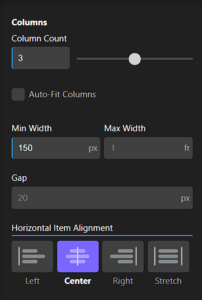
Columns
Column Count: Select how many columns you want in your grid.
Auto-Fit Columns: This overrides the column count and will fit as many children on one row as possible based on the Min Width value.
Min Width: Set the minimum width of each child. If you have problems making your grid responsive, you likely need to decrease this width if you have multiple children in one row.
Max Width: Set the maximum width of each child. The default “1fr” unit means that each column will take up one equal fraction of the available space based on the number of columns. If you have specified 4 columns, 1fr is equal to 25%.
Gap: Set the gap between your Grid columns.
Horizontal Item Alignment (Left, Center, Right, Stretch): If the Grid child isn’t taking up the full width of the available space, this setting will align the child within its Grid cell based on the Horizontal Item Alignment selection.
Rows
Row Behaviour
- Auto: The correct number of rows will be used based on the number of children in your grid.
- Explicit: Set the row count, min, and max heights.
- Row Count: Set how many rows you want in your Grid. This can be useful when using the Child Span Override (see below).
- Min Height: Set the minimum row height.
- Max Height: Set the maximum row height.
Match Height of Tallest Child checkbox: This option makes all rows the same height based on the tallest child in the Grid.
Gap: Set the gap between your Grid rows.
Vertical Item Alignment (Start, Center, End, Stretch): If the Grid child isn’t taking up the full height of the available space, this setting will align the child within its grid cell based on the Vertical Item Alignment selection.

Default Child Span
- Column Span: Set how many columns you want each child to span by default.
- Row Span: Set how many rows you want each child to span by default.

Child Span Override
This control will reflect the number of items in the Grid. Click on one of them to explicitly set the number of rows or columns they will span.
Column Span: The number of columns that the selected child will span.
Row Span: The number of rows that the selected child will span.
Reset Grid Children: Reset everything set in the Child Span Override section.
