The Toggle element displays an clickable toggle that will show or hide the element that follows it.
Add a Toggle element to your page from Add+ > Helpers > Toggle.
Toggle Structure
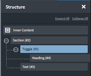
By default, a Heading element will be placed inside the Toggle element, but this can be deleted and replaced with any other elements.
The element placed immediately after the Toggle will be shown or hidden when the Toggle is clicked.
In the below example, a Heading is placed inside the Toggle. When it is clicked, the Text element that immediately follows the Toggle will be shown or hidden.

Toggle Settings
- Icon Color - set the color of the Toggle element’s icon.
- Icon Size - set the size of the Toggle element’s icon.
- Toggle Initial State - whether the toggle is open or closed when the page is first loaded
- Toggle Target (optional) - by default, this is left blank and the next element under Toggle will be used as the target. If, however, you want to toggle a specific element elsewhere on the page by clicking the Toggle element, you can specify the ID of the element to show/hide.

