The Pro Menu element displays menus created via Appearance > Menus in the WordPress admin area. The Pro Menu element provides advanced styling options for dropdowns and mobile menus.
Add the Pro Menu to your page via +Add > WordPress > Pro Menu.
Pro Menu Styling Options
The Pro Menu can be styled via the Primary tab in the Properties Pane.
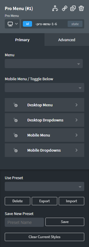
Menu
Choose the WordPress menu to display. Menus can be created via Appearance > Menus in the WordPress admin area.
Mobile Menu / Toggle Below
Choose the break point at which you would like to see the mobile menu (hamburger menu) displayed.
Desktop Menu
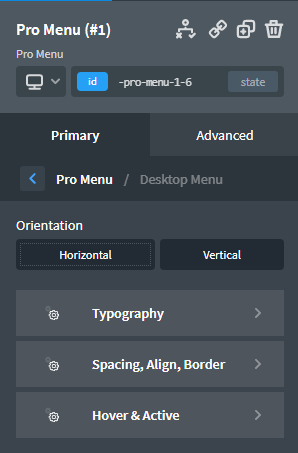
Orientation
Select whether you want a horizontal or vertical menu.
Typography
Full typographical controls over the Pro Menu's desktop menu items.
Spacing, Align, Border
Set the spacing between the menu items, alignment of the menu items and border radius of the menu items.
Hover & Active
Set the color and borders of hovered and active menu items. You can also control the transition duration for the hover state of menu items here.
Desktop Dropdowns
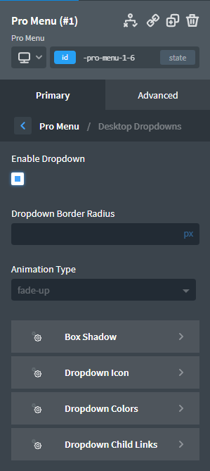
Enable Dropdown
Enable or disable child menu items.
Dropdown Border Radius
Set the border radius of the dropdown menu.
Animation Type
Select the type of animation applied when the dropdown menu enters the viewport. Animated dropdowns inherit their settings (aside from animation type) from the global Animate On Scroll settings at Manage > Settings > Global Styles > Animate On Scroll.
Box Shadow
Add a box shadow to the dropdown menu.
Dropdown Icon
Set and style the dropdown icon.
Dropdown Colors
Set the background, hover background, link and link hover colors.
Dropdown Child Links
Style the typography of menu links within the dropdown.
Mobile Menu
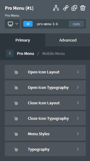
Open Icon Layout
Set the icon and text that will be shown when the mobile menu is closed. Change the icon size, text, colour, padding colour, border radius and transition duration.
Open Icon Typography
If you have set Icon Text in the Open Icon Layout tab then you can style the typography here.
Close Icon Layout
Set the icon and text that will be shown when the mobile menu is open. Change the icon size, text, position, colour, padding colour, border radius and transition duration.
Close Icon Typography
If you have set Icon Text in the Close Icon Layout tab then you can style the typography here.
Menu Styles
Off Canvas: Select if you want the mobile menu to animate in from off-canvas. Set the animation type and duration.
Style the mobile menu background colour, link colour, link padding, container padding and text alignment.
Typography
Style the mobile menu typography.
Mobile Dropdowns
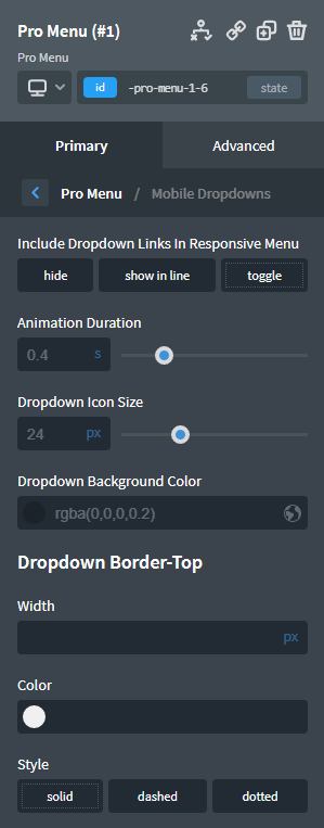
Include Dropdown Links In Responsive Menu
- Hide: Dropdown links will not be shown when the Pro Menu is in mobile mode.
- Show in line: Dropdown links will be shown as regular menu items, listed in line with top-level menu items, when the Pro Menu is in mobile mode.
- Toggle: Clicking the dropdown icon on a top-level menu item that has a child dropdown will cause the dropdown to expand or "toggle" open.
When Toggle is selected, you'll also have the ability to set the toggle animation duration, the dropdown icon size, the dropdown background color, and the top border of the dropdown container.
Presets
Select a preset to use a pre-styled menu.
Export and import menus using their JSON code.
To save your existing menu as a preset so that it can be used elsewhere on your site, enter a name in the box and click "Save".
Use the "Clear Current Styles" button to clear the styles assigned to the current selector for the Pro Menu element.

