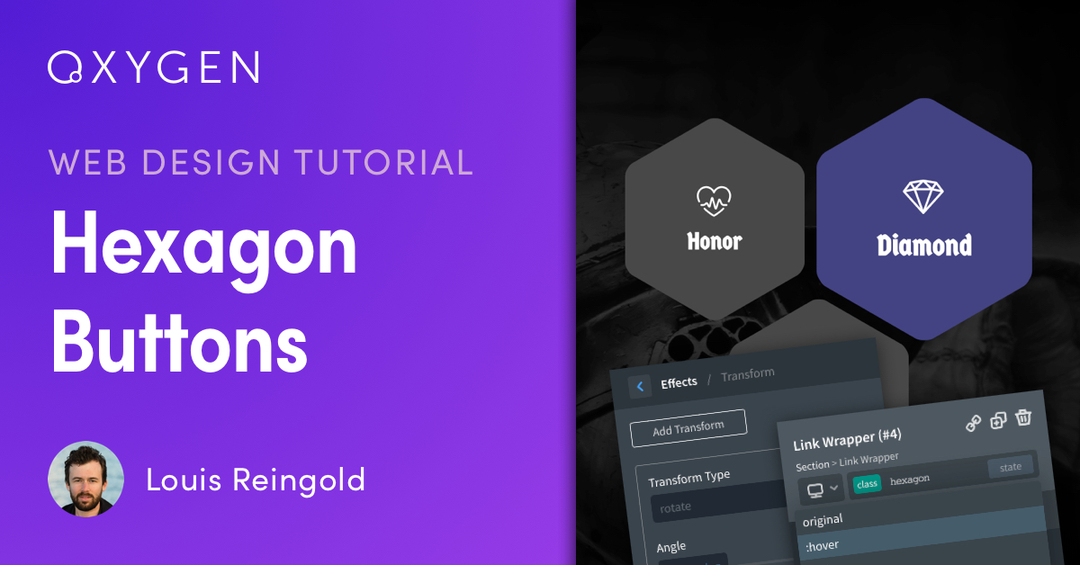
Tutorial: Animated Hexagon Buttons with CSS Transforms in Oxygen
In this tutorial, you’ll learn how to create custom animated buttons using the new CSS Transforms feature in Oxygen 2.2.
With Oxygen’s fundamental components and visual CSS manipulation, you can create advanced custom elements without needing pre-built blocks or add-ons.
You can visually style pseudo-elements like :before, :after, and states like :hover using the State Selector in the Properties Pane. Once you’ve applied some styling or CSS transforms to an element’s :hover state, you can set its transition duration under Advanced > Effects > Transition for a smooth hover effect.
In this tutorial, we’ll use link wrappers with classes so that we can style them all at once, and we’ll style their :before and :after pseudo-elements using CSS transforms to make them hexagonal. Finally we’ll apply a saturation filter and transform rotation effect on the link wrappers’ :hover states to make them go from grayscale to full color with a 360 degree rotation on hover.