Elementor vs Divi: Which Page Builder Wins?
When looking to create a WordPress website, you’ve likely come across Elementor and Divi. Both are two of the most popular page builders, and together, they power over 11 million websites worldwide.
While both builders can help you create stunning websites, they work in completely different ways.
We’ve spent time with both builders, testing everything from simple pages to complex builds, to give you the insights you need. Here’s what we’ll cover:
And much more….
What is Elementor?
Elementor is a drag-and-drop WordPress page builder that lets you create custom websites without writing any code. Since its launch in 2016, it’s grown to become the world’s most popular WordPress page builder, powering over 9.3 million active websites.
Elementor’s success comes from its generous free version with over 30 widgets that lets users build complete websites at no cost. This popularity has led to a thriving ecosystem of third-party add-ons that extend features from advanced forms to booking systems.
What is Divi?
Divi is both a WordPress theme and a visual page builder created by Elegant Themes in 2013. Unlike other builders that work as plugins, Divi integrates deeply into WordPress as a complete design framework, powering approximately 1.9 million websites worldwide.
What makes Divi unique is its everything included approach. You get unlimited licenses, lifetime options, and access to their entire product suite without worrying about extra costs.
Now that you understand what each builder brings to the table, let’s see how they actually perform in real-world use.
1. Elementor vs Divi: Performance Testing
Speed matters more than anything else when it comes to websites, but page builders have a reputation for slowing things down.
To help you understand how these builders compare performance-wise, we ran comprehensive tests across three different complexity levels. Our testing included everything from basic layouts to complex pages with dynamic elements. For complete testing details and full results, check out our in-depth Elementor vs Divi performance comparison.
Here’s what our testing revealed across various page complexity levels:
| Page Complexity | Elementor Performance | Divi Performance |
| Basic | Solid Core Web Vitals performance and decent loading times. | Narrow win over Elementor, showing better frontend speeds and fewer server hits. |
| Standard | Decent performance score and smaller overall page sizes. | Marginally improved performance results and faster loading speeds. |
| Complex | Outperformed Divi by showing much stronger performance metrics. | Poor performance scores, some dropping to the ‘worse’ level. |
We observed interesting performance variations between the page builders. With simple designs, Divi typically performed marginally better, while Elementor showed stronger results when handling complex layouts. Both lack the speed of an advanced page builder like Breakdance, but they should be sufficient for average use cases.
However, looking at frontend performance is only half the story. Just as crucial is backend performance, which tells how responsive the editor feels while you’re designing and how smoothly you can complete your creative tasks.
Let’s take a look at how these two popular builders compare when it comes to editor responsiveness:
| Page Complexity | Elementor Backend Experience | Divi Backend Experience |
| Basic | Clean editor performance with swift adding and editing of elements. | Quick editor response for straightforward tasks. |
| Standard | Editor remained fast with smooth transitions between tabs. | Less responsive with obvious lag on cheaper hosting environments. |
| Complex | Might have occasional delays, but generally not as bad as Divi. | Might get laggy and slow, especially with interactive elements and complex nesting. |
Looking at the above results, you can see that both page builders handle simple to moderate designs pretty smoothly in the backend editor. Where things get interesting is when you start creating more complex layouts.
If you’re planning to build feature-rich pages with lots of dynamic elements, especially in Divi, you might notice some slowdowns in the editor. Again, if you want a true racecar, you’ll have to switch to something like Breakdance, but Elementor can handle the in-between.
Want to dive deeper into exactly what causes these performance differences with complex designs? Check out our comprehensive Elementor vs Divi performance comparison for all the details.
2. Elementor vs Divi: Ease of Use
When it comes to building your pages, the interface you’ll interact with daily can make or break your design experience. Your comfort level with the UI directly impacts how efficiently you can work.
While both Elementor and Divi provide an intuitive drag-and-drop editor, they’ve designed the interface with completely different approaches to how you’ll interact with elements.
Let’s take a quick look at a simple task of adding a heading to highlight these differences:
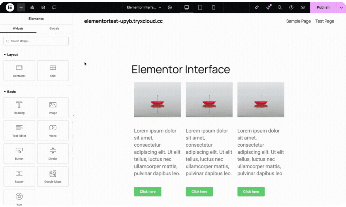
In Elementor, everything happens from the fixed left sidebar. You simply grab your heading widget from this sidebar and drag it onto your canvas. All your customization options then appear neatly organized in that same sidebar, while you see your changes reflected in real-time on the right.

This creates a very organized, predictable workflow where your element settings always stay in one consistent location.
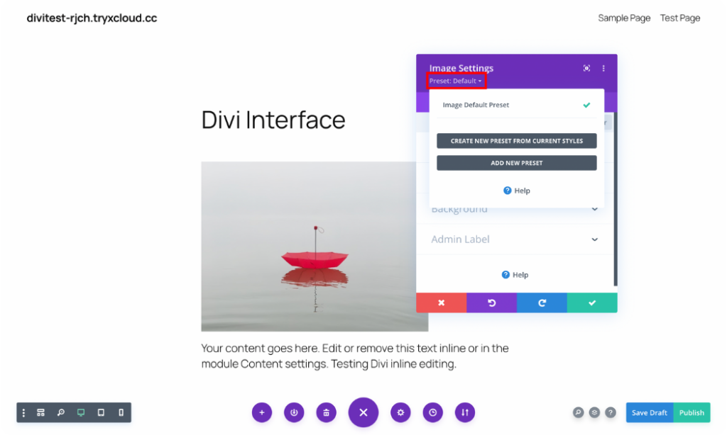
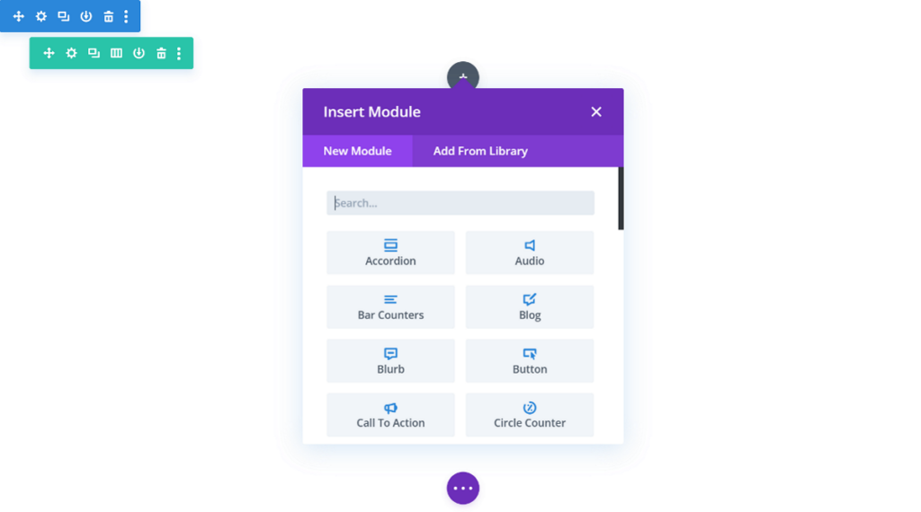
Divi takes a more flexible approach. To add a heading, you simply click the “+” button right on your canvas. A floating module list appears over your design, where you can search for and select the heading module. Once added, all its settings display in this same movable window.

This approach gives you the advantage of a full-screen view of your work while allowing you to position the editing panels wherever feels most comfortable. It’s perfect if you prefer a customizable workspace that adapts to how you like to design.
Which approach works better? It really comes down to your personal working style. If you prefer a structured, always-consistent workspace with settings in fixed locations, Elementor’s sidebar-based interface might feel more natural. If you enjoy a more flexible, full-screen design experience with movable panels, Divi’s floating interface could be your perfect match.
Want to dive deeper into all the UI features and editing capabilities of both builders? Check out our comprehensive Elementor vs Divi interface comparison guide for all the details.
3. Elementor vs Divi: Styling Features
When it comes to making your website stand out visually, both Elementor and Divi give you amazing control over the way things look, from colors and fonts to spacing and special effects. While they both offer plenty of styling options, they each handle global design settings in their own unique way.
Elementor really shines with its Global Styling system. Its Global Site Settings lets you set up your design elements once in a central location and have them apply consistently across your entire website. This is super helpful for keeping your brand looking uniform and makes changing designs across your whole site a breeze.
Divi takes a different approach with its Presets feature. This lets you create a custom style for any module, save it, and then quickly apply that same look to other modules of the same type throughout your website. It’s a real time-saver that helps maintain a consistent look for similar elements across your pages.
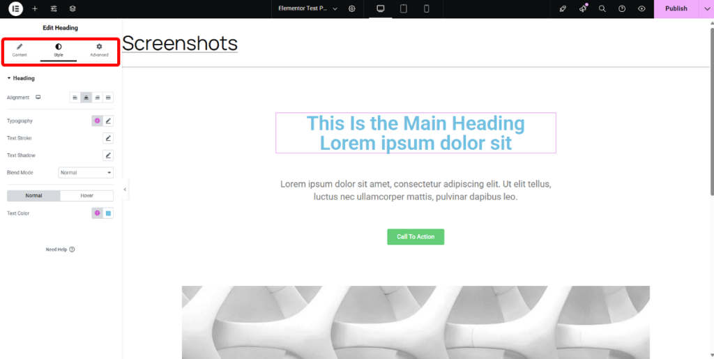
Both builders also keep their styling options neatly organized in tabbed panels. With Elementor, you’ll work with Content, Style, and Advanced tabs in the fixed sidebar that stays in place while you work.
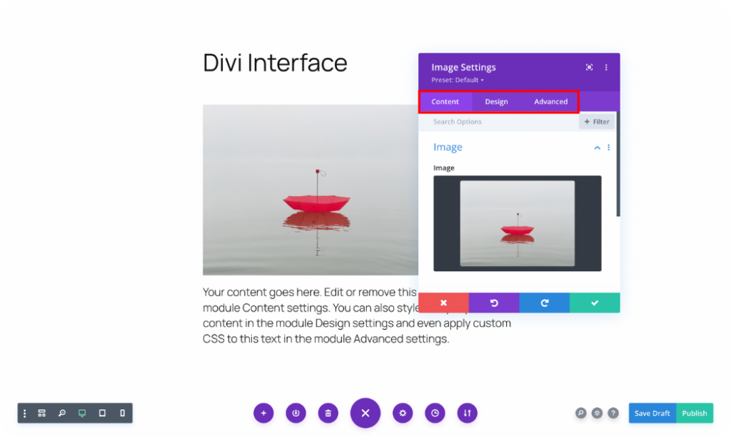
Divi adds its options into Content, Design, and Advanced tabs within floating popup windows that you can move around your screen.
These tabbed panels are where all the magic happens, as they include controls you’ll use to fine-tune how your elements look. Both builders also make it easy to adjust your designs for different screen sizes, ensuring your site looks great on everything from phones to desktop computers.
Want to explore all the styling capabilities in greater detail? Check out our detailed Elementor vs Divi interface comparison article for the full breakdown.
4. Elementor vs Divi: Building Elements
When you’re building pages with any visual builder, you’ll be working with its collection of elements. You can think of these elements as building blocks that let you add everything from text and images to more complex features throughout your website.
Having access to a comprehensive selection of these building blocks means you can create just about any design you can imagine without diving into code.
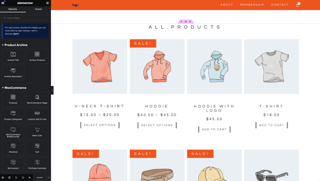
In Elementor, these building blocks are called Widgets. Elementor structures your page using Flexbox Containers and Grids, and then you place your Widgets within this flexible framework.
If you’re using the free version of Elementor, you’ll have access to more than 30 essential widgets, covering all the foundational elements you’d expect for web design.
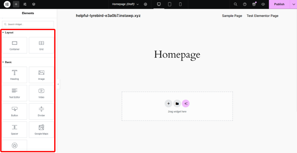
When you upgrade to Elementor Pro, your creative possibilities expand with over 70+ premium widgets that let you build forms, testimonials, tabbed content, and other advanced elements. The higher-tier plans even include specialized widgets for theme building and WooCommerce integration.
When it comes to Divi, its elements are known as Modules, and it organizes a page using Sections and Rows.
There isn’t a free version of Divi, and every Divi license comes with access to over 68 modules. This collection is divided into content, WooCommerce, and structural modules.
While both builders offer a good collection, the total number of Divi modules is slightly fewer than Elementor Pro’s extensive widget library.
5. Elementor vs Divi: Theme Building
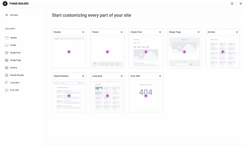
When using page builders like Elementor and Divi, you’re no longer held back by your theme constraints. These builders allow you to visually customize every aspect of your site from headers, footers, post layouts, and more using a simple drag-and-drop interface. But they each take their own approach to the process.
Elementor lets you create custom templates for virtually every part of your website, such as:
- Headers and footers
- Individual posts and pages
- Archive listings (for blogs and categories)
- WooCommerce product and shop pages
- Search results pages
- Custom 404 error pages
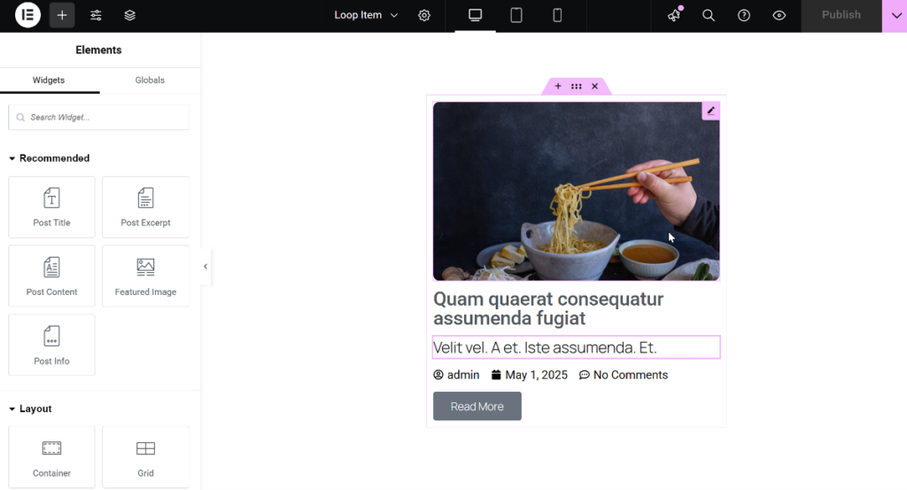
It lets you design everything using the familiar interface, with the added bonus of specialized Theme Builder widgets like Post Title, Post Meta, Featured Image, Post Content, and more.
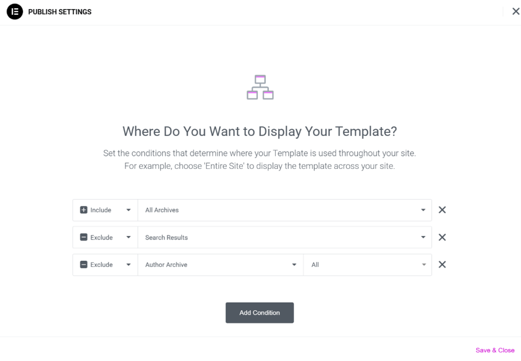
Once your design is complete, you can easily set Display Conditions to control exactly where your template appears throughout your site.
Divi’s workflow starts in the backend, where you’ll first select your template type and display conditions. The actual design work happens in the same visual builder you already know.
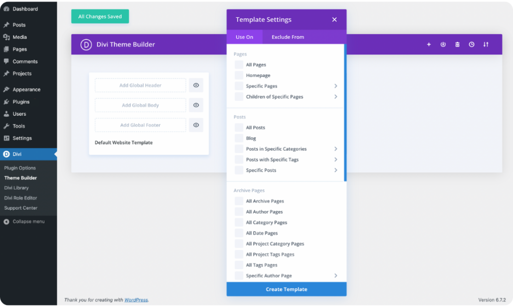
When it comes to template support, Divi offers essentially the same types as Elementor.
One notable difference is when working with content lists like blog archives. Elementor includes a Loop Builder feature, which lets you design a single card exactly how you want it using any Elementor widget, then automatically repeats that design for all items in your query. This gives you incredible creative freedom for building unique archive layouts and custom content grids.
Divi takes a more structured approach with its Blog module, which displays your posts nicely but with somewhat more limited design flexibility compared to Elementor’s highly customizable solution. Both lack the advanced theme-building capabilities of Breakdance, but they should get the job done for the average designer.
6. Elementor vs Divi: WooCommerce Integration
If you’re planning to build an online store, integrating with WooCommerce is absolutely essential.
Both Elementor and Divi recognize this and include many dedicated features to help you easily design great-looking and functional online shops right within their builders.
Elementor extends its powerful Theme Builder features to WooCommerce and includes over 24 dedicated widgets. These special widgets let you easily design individual product pages, create dynamic product grids that display your items beautifully, and even customize crucial pages like your cart and checkout pages.
However, it’s worth noting that while Elementor’s Global Styles are powerful for general site design, they don’t give you as much granular control over WooCommerce elements directly.
Divi also offers deep integration with WooCommerce. Once you have both installed, it automatically unlocks a set of specialized WooCommerce modules directly within its visual builder.
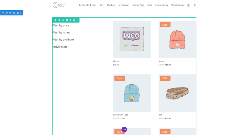
You get access to 25 unique WooCommerce modules that give you a similar level of control as Elementor. However, unlike Elementor, it provides separate modules for specific parts of the checkout process, like billing, shipping, and payment. This gives you fine-tuned control, allowing you to design the checkout flow exactly as you need it.
7. Elementor vs Divi: AI Features
You’ve probably noticed how AI is transforming the way we build websites these days. Both Elementor and Divi have jumped on this trend and added AI features right into their builders.
When you’re working in either builder, you’ll find AI assistants to help you with all sorts of tasks, such as designing layouts and generating text to creating images, editing photos, writing code, and much more.
To get a better feel of these AI features, let’s look at how each builder approaches a typical task of creating text content.
In Elementor, you’ll find the AI writing assistant right where you add text in a widget.
When you need to write something, like a heading or a paragraph, you simply click the “Edit with AI” or “Write with AI” button.
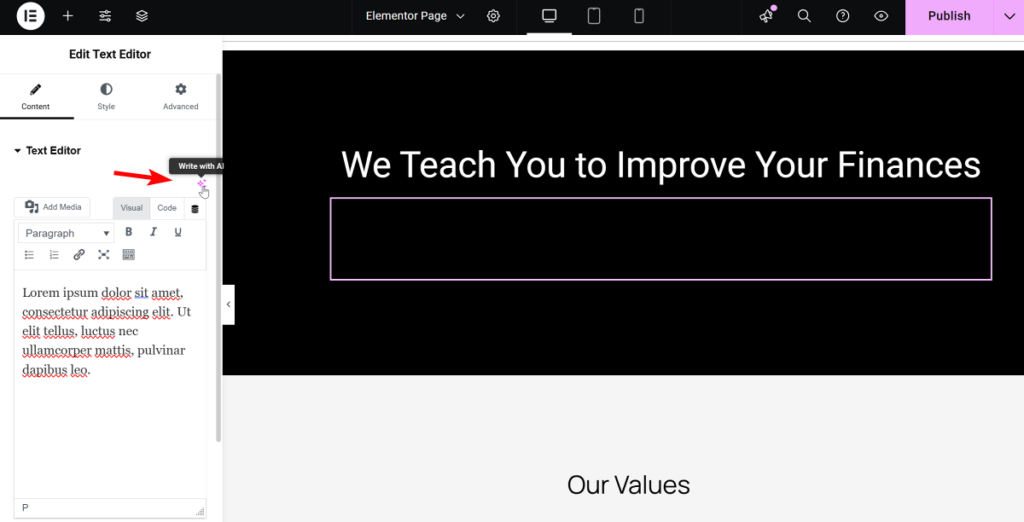
This opens up a window where you can describe the content you need.
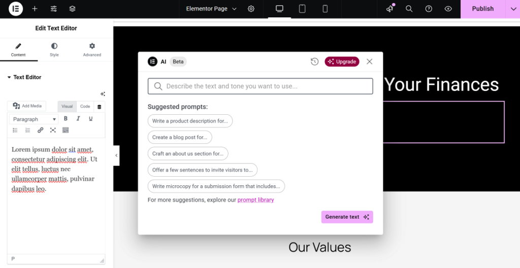
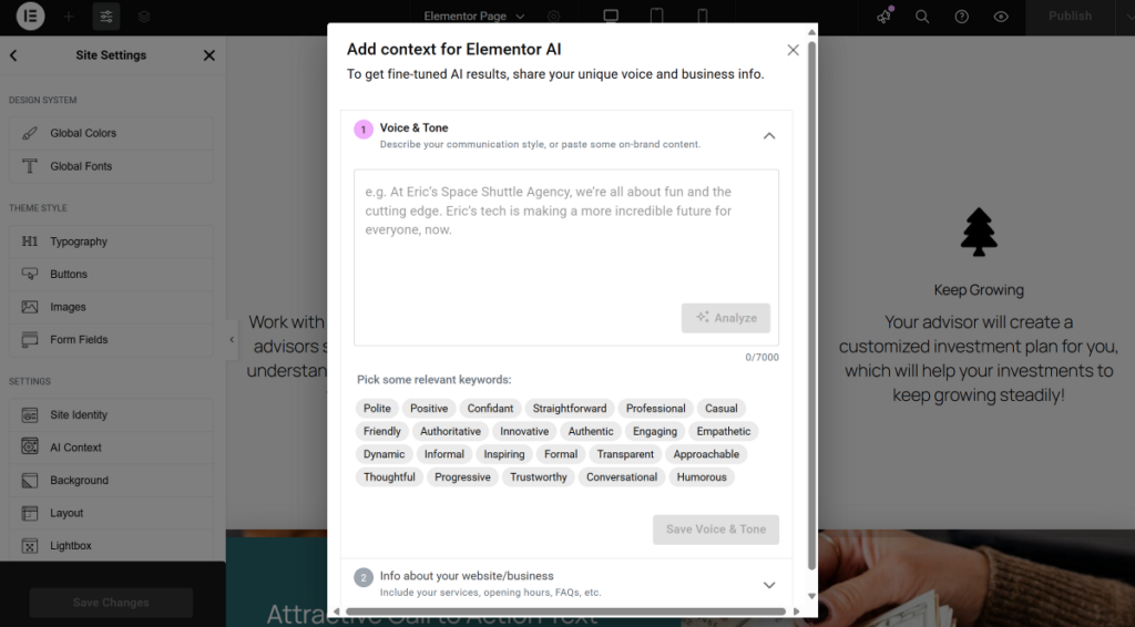
Elementor AI can even adapt to your brand’s unique style, ensuring all text you generate sounds consistent.
Divi takes a similar but slightly different approach.
When you’re within any text-based module, you’ll see a “Generate Content with AI” button.

Here, you can tell Divi AI what kind of content you’re looking for, set the desired tone, and even include specific keywords for SEO.
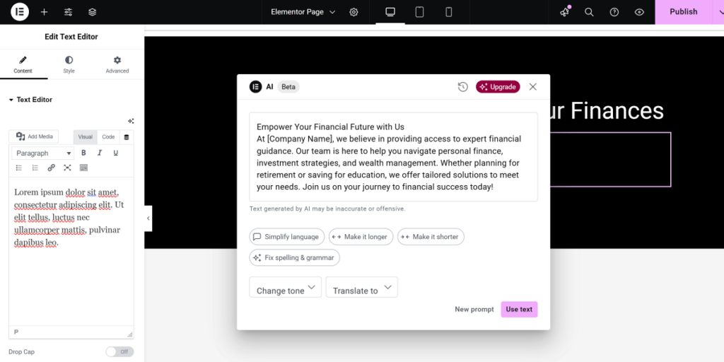
What’s really cool is that both builders offer options to refine the text once it’s generated. You can quickly rephrase sections, adjust the length, simplify complex sentences, or correct any grammar and spelling errors with just a few clicks.
Beyond this, both builders offer even more AI features. For a complete look at all the AI features in both builders, be sure to check out our detailed Elementor vs Divi AI Features comparison.
8. Elementor vs Divi: Unique Features
Apart from AI features, both Elementor and Divi also include some special, unique features that truly set them apart.
For a full deep dive into all the unique features both builders offer, make sure to read our detailed Elementor vs Divi Unique Features article. To give you an idea, let’s look at one truly handy, unique feature from each, showing off the cool ways they help you build.
Elementor includes some really powerful features. A great example is its built-in Notes for Collaboration.

This feature lets you add comments and feedback directly onto elements within the editor itself. It’s a valuable feature for teams or when working with clients, as it keeps all communication visually tied to the design, making feedback clear and actionable without needing external tools.
Beyond the Notes feature, Elementor also offers features like:
- Loop Builder
- Popup Builder
- Link in Bio Widget collection (perfect for social media profiles)
- Copy & Paste between sites (a real time-saver for multi-site users)
…. and more.
Divi also packs many unique features, often focusing on making your workflow more efficient. One of its time-saving features is Multi-Select and Bulk Editing.

This makes it incredibly easy to select several modules, rows, or columns at once and then apply changes to their common settings simultaneously. It’s a huge time-saver that helps you make consistent adjustments across your layouts much faster than editing elements individually.
Some other unique features you’ll absolutely love in Divi include:
- Wireframe View (great for seeing your page structure)
- User Role Editor (gives you precise control over who can edit what)
- A/B Testing (Split Testing) (a data-driven way to improve your site)
- Find & Replace Styles and Extend Styles (for quick, site-wide design tweaks)
…. and more.
Both builders, as you can see, come with their own unique features. For a closer look at each one, we recommend taking a look at our detailed unique features comparison article.
8. Elementor vs Divi: Template Library
When launching a new website, starting with ready-made designs can significantly simplify your entire site-building journey.
Both Elementor and Divi provide extensive template libraries that can really speed up your design process. However, they each have their own unique way of organizing these templates.
Elementor organizes its templates into several helpful categories. You can pick from complete Page templates that give you full-page layouts, or choose more focused Block templates that provide individual sections you can mix and match.
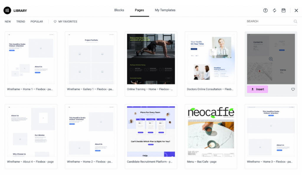
For bigger projects, Elementor also neatly groups related templates into Template Kits. These kits give you everything you need, from homepages to contact pages, to create a complete website with a unified theme.

When it comes to numbers, Elementor Pro gives you access to over 300 full-page templates and more than 100 Template Kits.
Divi, on the other hand, uses a slightly different approach with its Layout Packs. Instead of standalone templates, it gives you access to a full collection of themed templates specifically designed for particular types of websites.
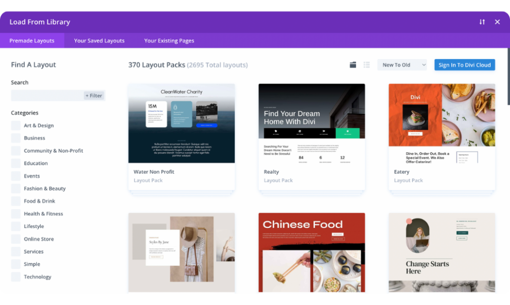
It has over 350 Layout Packs containing a whopping 2500+ individual page layouts. This approach makes it incredibly simple to import an entire website’s worth of pages in one go.
9. Elementor vs Divi: Third-Party Add-ons/Extensions
When working on a unique project, you might find yourself needing a really specific feature that goes beyond a builder’s core offerings. That’s where third-party add-ons and extensions come in.
Both Elementor and Divi have strong communities and thriving ecosystems of developers creating extra tools.
Elementor particularly boasts an incredibly rich and extensive ecosystem of third-party add-ons. Because it’s so widely used, many developers create plugins specifically to add various features to Elementor.
You’ll essentially find add-ons for everything from simple widget packs that provide extra design elements to complex plugins for building directories, booking systems, or advanced forms.
A great example, especially for eCommerce, is JetWooBuilder from Crocoblock. This plugin is tailor-made for WooCommerce and Elementor, adding over 60 widgets.
Divi also has a fantastic and growing marketplace of third-party extensions and child themes. Unlike Elementor, Elegant Themes actively curates their Divi Marketplace, which means you get everything in one central location. You’ll find over 250 extensions available there.
These extensions help you add new modules, integrate with other services, or provide fresh layouts and features. Some popular examples, like Divi Supreme Pro, Divi Essential, and DiviFlash, act as all-in-one plugins. They can add a huge collection of new modules (often 50-60+), and hundreds of pre-made layouts for pages and sections.
11. Elementor vs Divi: Pricing
Cost is definitely a big factor when choosing a page builder. The number of websites you’re planning to build can significantly influence which option makes the most financial sense.
Elementor has a free version, which is perfect for beginners or anyone who wants to build a basic website.
If your project demands premium features like Theme Builder, Popup Builder, and an expanded widget library, Elementor Pro offers plans starting at $60 per year, which includes a license for one website.
It also provides other plans that include more license options:
- Advanced Solo: $84 per year for 1 website (86 Pro widgets)
- Advanced: $99 per year for 3 websites.
- Expert: $204 per year for 25 websites.
- Agency: $399 per year for 1000 websites.
Divi takes a slightly different approach to pricing, focusing entirely on premium offerings that include unlimited licenses with all plans. Its pricing starts at $89 per year, which gives you complete access to the Divi Theme and Builder, plus the Extra theme, Bloom, and Monarch.
For those looking for a long-term solution, there’s also a lifetime membership plan that provides access to all the same features for a single, one-time payment of $249.
12. Elementor vs Divi: What Users Are Saying
When choosing a page builder, real opinions of people who use them every single day matter. It gives us a clear picture of their strengths, how responsive their support is, and what the general user experience is like.
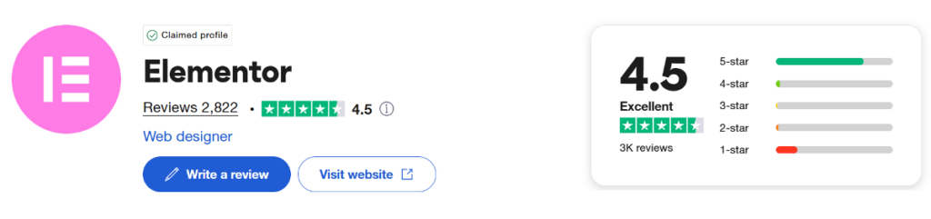
Elementor, being a very popular builder, consistently receives strong reviews. On Trustpilot, it has an Excellent rating. On other platforms like G2 and Capterra, it scores a solid 4.4 and 4.6 out of 5 stars, respectively.
Most users praise Elementor for being easy to use and intuitive, especially for beginners. However, some users mention concerns about pricing at higher tiers and occasional temporary glitches that can appear with major updates.
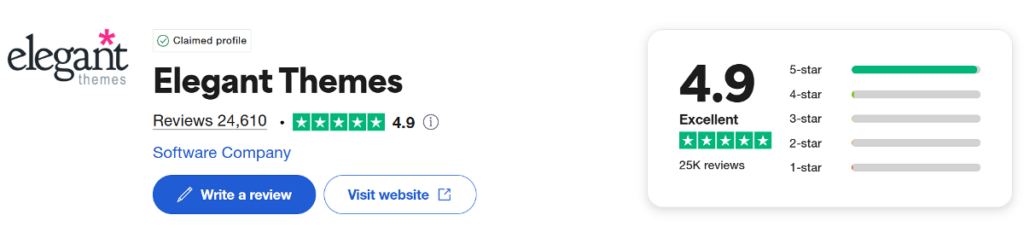
Divi also has a very loyal fan base, consistently ranking it as one of the best-reviewed WordPress products. It holds an “Excellent” rating on Trustpilot and impressive scores like 4.9 out of 5 stars on G2 and 4.8 stars on Capterra.
Users frequently highlight Divi’s customer support as fast, helpful, and available 24/7. The lifetime license option is a major draw for many, offering incredible long-term value. However, some users find Divi’s interface has a bit of a learning curve initially, especially if they’re coming from other builders.
Summary: Which Is a Better Page Builder?
After testing both Elementor and Divi across various areas, it’s clear that both builders excel in different ways. Rather than declaring one as the definitive winner, it’s better to consider your specific project needs and working style.
If you’re just getting started or working on a tight budget, Elementor’s generous free version gives you everything needed to build professional websites. Its organized sidebar interface is beginner-friendly, and when you’re ready to upgrade, the performance advantages become clear with complex designs.
For those managing multiple websites or planning long-term projects, Divi’s unlimited licensing model offers exceptional value. You get access to over 350 layout packs that speed up development, plus lifetime pricing that eliminates recurring costs. Its flexible visual editor might feel more natural if you prefer working with the full canvas view.
No matter which builder you choose, both will help you create solid websites without code. However, if you need something more than this in terms of performance and truly advanced capabilities, you’ll have to turn to a builder like Breakdance.
Frequently Asked Questions
1. Is the Divi theme builder free?
The Divi theme builder is not free. All of Divi’s features, including the template library and theme builder, are part of their premium plans that start at $89 per year. However, you do get unlimited website usage and access to their entire product suite with any plan.
2. Is Elementor easy for beginners?
Elementor is really easy for beginners. Its fixed sidebar interface is intuitive and predictable, making it simple to learn the basics. The drag-and-drop editor is straightforward, and the generous free version lets you practice without any upfront costs.
3. Does Elementor require coding?
Elementor doesn’t require any coding knowledge. It’s a completely visual drag-and-drop page builder that lets you create custom designs using widgets and styling options. However, if you do know code, you can add custom CSS and HTML for extra customization.
4. Is Divi good for beginners?
Divi is good for beginners, though it has a slightly steeper learning curve than some builders. Its floating interface and comprehensive feature set might feel overwhelming at first, but the extensive template library and helpful tutorials make it manageable for newcomers.
5. Which WordPress builder is best?
The best WordPress builder depends on your specific needs. Elementor excels with complex designs and has a great free version, while Divi offers unlimited licensing and comprehensive templates. Both are solid choices for different situations and user preferences, though they don’t quite match the power and flexibility of a builder like Breakdance.
6. Why is Divi Builder so slow?
Divi can become slow with complex page designs that include many nested elements and interactive features. Our testing showed performance drops on complex layouts, especially in the backend editor. Simpler designs typically perform much better.
7. Is Elementor Builder free?
Elementor has a generous free version with over 30 widgets that lets you build complete websites at no cost. For advanced features like theme building, popup builder, and premium widgets, you’ll need Elementor Pro starting at $60 per year.
8. What is Elementor popup builder?
Elementor’s popup builder is a Pro feature that lets you create custom popups and overlays using the same drag-and-drop interface. You can design popups for newsletters, promotions, or announcements, and set specific triggers for when they appear on your site.
Related Information
- Visual Builder Comparison: Oxygen vs Elementor vs Divi vs Beaver Builder
- Oxygen vs. Elementor
- Elementor vs Divi vs Beaver Builder vs Oxygen: Bloat
- Best Elementor Alternatives for Designing Better Websites
- Best Divi Alternatives to Design Better Websites
- Elementor vs Breakdance: Which is Best and Why